
Data Visualization Principles: A Beginner's Guide for Students (2026)

Confused by charts and graphs? Learn the core data visualization principles every student should know explained in simple, easy-to-follow language.
A beginner-friendly guide to data visualization principles for 12th grade and college students. Learn chart types, common mistakes, and the best tools to start visualizing data today.
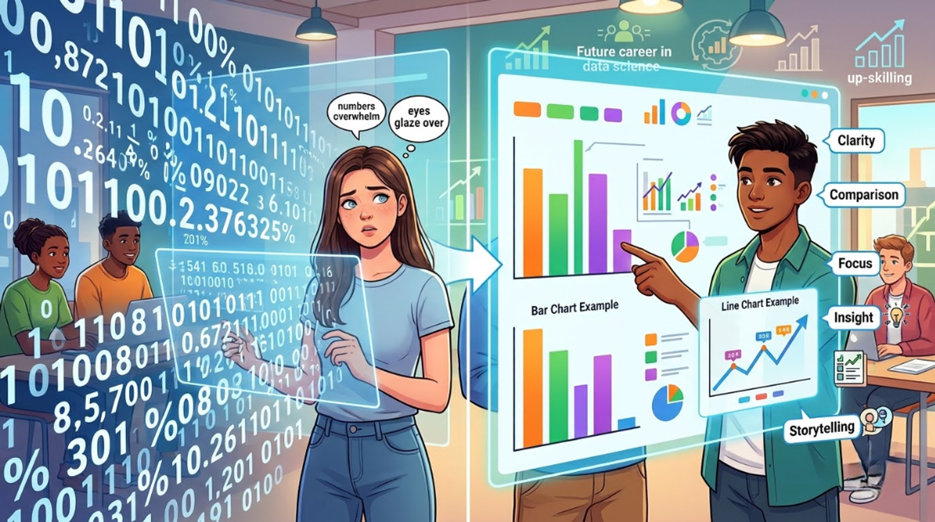
If numbers make your eyes glaze over but a good chart instantly makes sense, you already understand why data visualization matters. It's the skill of turning rows of confusing numbers into pictures bars, lines, colors, and shapes that anyone can understand in seconds.
Whether you're in your final year of school, just started college, or are exploring a career in data science, learning the core data visualization principles early will give you a real head start. Companies today don't just want people who can collect data they want people who can explain it clearly. This guide breaks down everything you need to know, in plain, simple language.
What Is Data Visualization? (Simple Definition)
Data visualization is the practice of representing information using visual elements like charts, graphs, and maps instead of plain text or spreadsheets. Think of your school report card a bar chart comparing your marks across subjects tells the story faster than a table of numbers ever could.
In simple words: data visualization is the art and science of showing data so it's easy to understand at a glance.
This is a core part of data analytics, business intelligence, and data science three of the fastest-growing career fields for students today. If you're curious where this skill leads, CDPL's Data Science overview is a good place to see the full career path.
Why Data Visualization Matters for Students
You might be thinking, "I'm still in school or college , why does this matter to me?" Here's why:
- It's used in almost every field - business, healthcare, sports, government, and even social media analytics.
- It builds a skill recruiters look for - Employers hiring for data analytics, testing, and AI/ML roles consistently rate visualization and communication skills as must-haves.
- It helps you in academics right now - from science fair projects to economics assignments, presenting data visually gets you better grades.
- It's beginner-friendly - You don't need to be a coding expert to start; tools like Excel and Power BI let you build your first chart in minutes.
Students who start practicing data visualization techniques early build a portfolio they can show in interviews long before they graduate.
Types of Data Charts and Graphs You Should Know
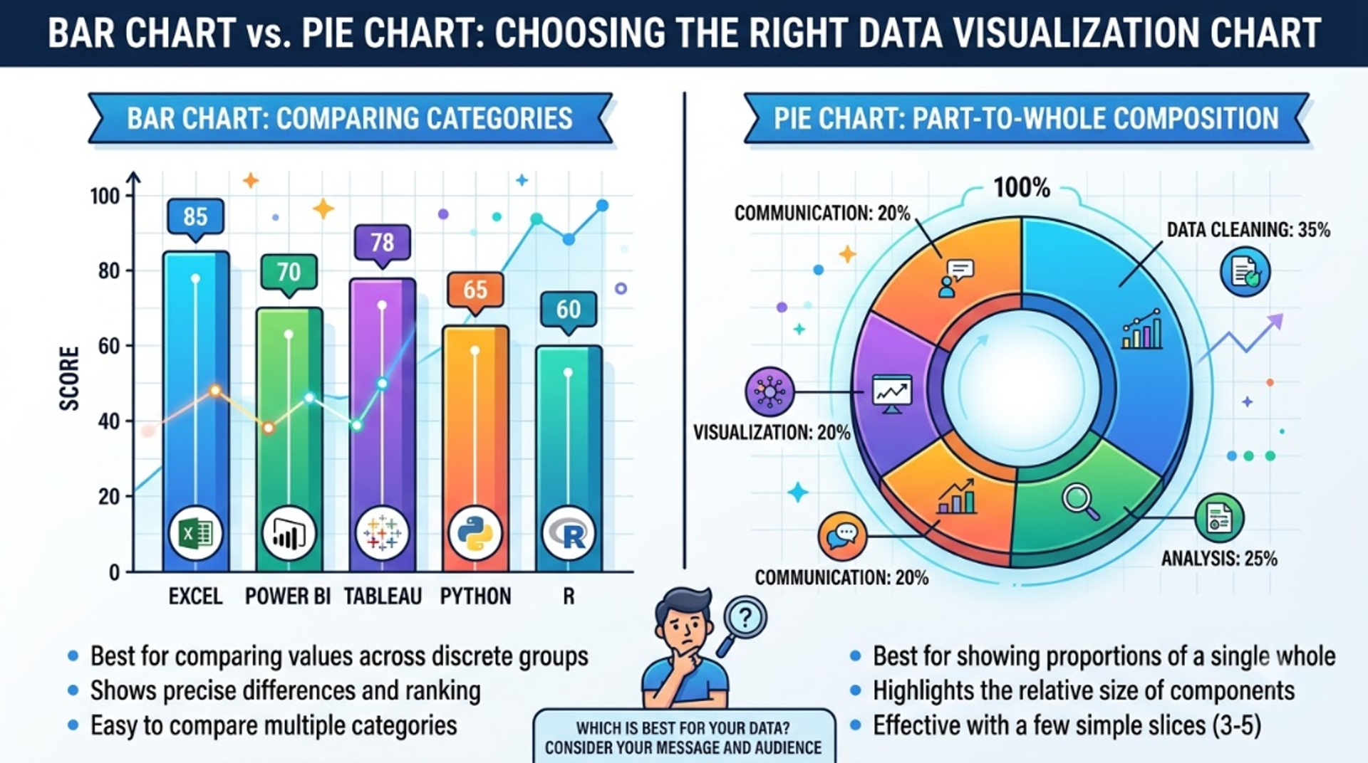
Not every chart works for every kind of data. Here's a simple cheat sheet:
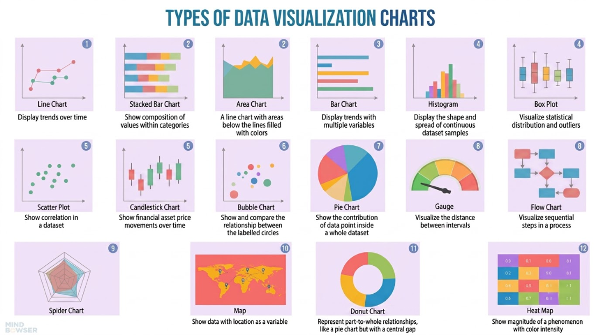
Learning when to use which chart is one of the most practical data visualization tips for beginners and it's exactly the kind of hands-on skill taught in CDPL's Data Analytics & Visualization with Tableau course.
8 Core Data Visualization Principles Every Beginner Should Know
These principles are used by data analysts and data scientists at every level from your first school project to a corporate dashboard.
1. Start With the Question, Not the Chart
Before opening any tool, ask: "What do I want people to understand from this data?" The right chart type follows naturally once you know your goal.
2. Simplify Remove Visual Clutter
Only include what helps the viewer understand the data. Remove unnecessary gridlines, 3D effects, and extra borders. This is sometimes called the data-ink ratio the less clutter, the clearer the message.
3. Use Color With Purpose, Not Decoration
Color should guide attention, not just look pretty. Use one color to highlight the most important data point, and keep the rest neutral (gray works well). Avoid red-green combinations, since some viewers are color-blind.
4. Keep Your Scale Honest
Never cut off or stretch a y-axis to make a small change look huge this is one of the most common ways charts mislead people, even by accident. Always label your axes clearly.
5. Label Directly Instead of Relying Only on Legends
A chart with data labeled directly on the bars or lines is faster to read than one where people have to keep checking a legend on the side.
6. Choose the Right Chart for Your Data
Refer back to the chart cheat sheet above a pie chart with 15 slices is almost impossible to read, while a bar chart handles the same data easily.
7. Design for Your Audience
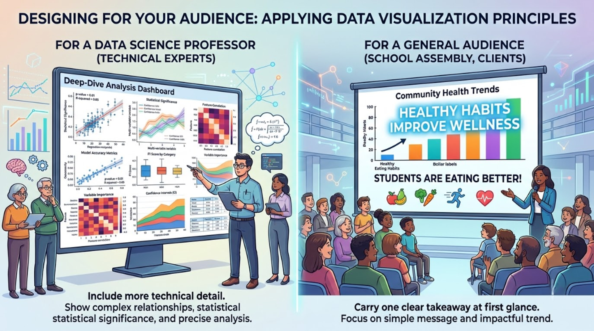
A chart for your data science professor can include more technical detail. A chart for a general audience like a school assembly or a client should carry one clear takeaway at first glance.
8. Review and Improve
Your first chart is rarely your best one. Show it to a friend without explaining it if they misread it, the chart needs fixing, not the viewer.
Common Data Visualization Mistakes Beginners Make
Even smart students make these errors when they're just starting out:
- Using a pie chart for too many categories - anything beyond 5–6 slices becomes unreadable.
- Choosing color randomly instead of using it to highlight meaning.
- Skipping axis labels and titles, leaving viewers confused about what the chart even shows.
- Overloading one chart with too much data instead of splitting it into two clear visuals.
- Copying a chart style without checking if it actually fits the data being shown.
Avoiding these mistakes instantly makes your charts look more professional, a small change with a big impact.
Best Tools to Learn Data Visualization as a Student
You don't need every tool at once. Here's a simple beginner-to-advanced path:
- Microsoft Excel - the easiest starting point; great for school and college projects. CDPL's Excel for Data Analytics & Visualization course covers this in depth.
- Power BI - a popular business tool for building interactive dashboards. Learn it in the Power BI course.
- Tableau - widely used in the industry for drag-and-drop visual storytelling, covered in the Tableau course.
- Python (Matplotlib & Seaborn) - ideal once you're comfortable coding; used heavily in data science roles. Explore it in Advanced Data Analytics with Python Libraries.
- R (ggplot2) - popular in academic and research settings; covered in Data Visualization using R Programming.
If you want to go further and combine visualization with machine learning and predictive analytics, the Machine Learning and Data Science with Python program is a strong next step.
How to Start Practicing Data Visualization Today
You don't need a fancy dataset to begin. Try these simple beginner projects:
- Chart your own study hours vs. test scores across a month.
- Visualize your school or college's sports team performance over a season.
- Track and graph your monthly pocket money or expenses.
- Compare rainfall or temperature data for your city across the year using free public datasets.
Each of these projects teaches you real data visualization techniques while building something you can talk about in a college application or job interview.
Frequently Asked Questions
1. What is data visualization in simple words?
Data visualization is turning numbers and data into charts, graphs, or images so they are easy to understand quickly.
2. Why is data visualization important for students?
It helps you present academic projects better, builds a skill needed for data science and analytics careers, and is used across almost every industry today.
3. Which tool should a beginner learn first?
Excel is the easiest starting point. Once comfortable, move to Power BI or Tableau, and later Python or R for more advanced, code-based visualization.
4. Can I learn data visualization without coding knowledge?
Yes. Tools like Excel, Power BI, and Tableau use drag-and-drop features, so you can create professional charts without writing a single line of code.
5. What is the biggest mistake beginners make in data visualization?
Choosing the wrong chart type for the data like using a pie chart with too many categories is one of the most common beginner mistakes.
Final Thoughts
Mastering data visualization principles isn't about becoming a design expert it's about learning to communicate clearly with data, a skill that will help you in school projects today and in your career tomorrow. Start small, practice with real data around you, and gradually explore tools like Excel, Power BI, Tableau, and Python.
If you're serious about building this skill with expert mentorship, live projects, and placement support, explore CDPL's full range of Data Science and Data Analytics courses or browse more beginner-friendly guides on the CDPL Blog to keep learning.
Tags

Cezzane Khan is a dedicated and innovative Data Science Trainer committed to empowering individuals and organizations.