Loading...
Loading...
Cinute Digital
Head Office (CDPL)
Study Center MeghMehul Classes (Vasai)


ISO 9001:2015 (QMS) 27001:2013 (ISMS) Certified Company.
© 2026 Cinute Digital Pvt. Ltd. — All Rights Reserved.
Transform complex datasets into interactive, high-impact visualizations. Explore the definitive guide to structuring, designing, and optimizing professional Tableau dashboards.
Dive into our comprehensive guide on step-by-step Tableau dashboard creation. Discover how modern data analysts build dynamic, AI-ready visual narratives that drive critical business decisions. Elevate your analytics skills with our latest masterclass.
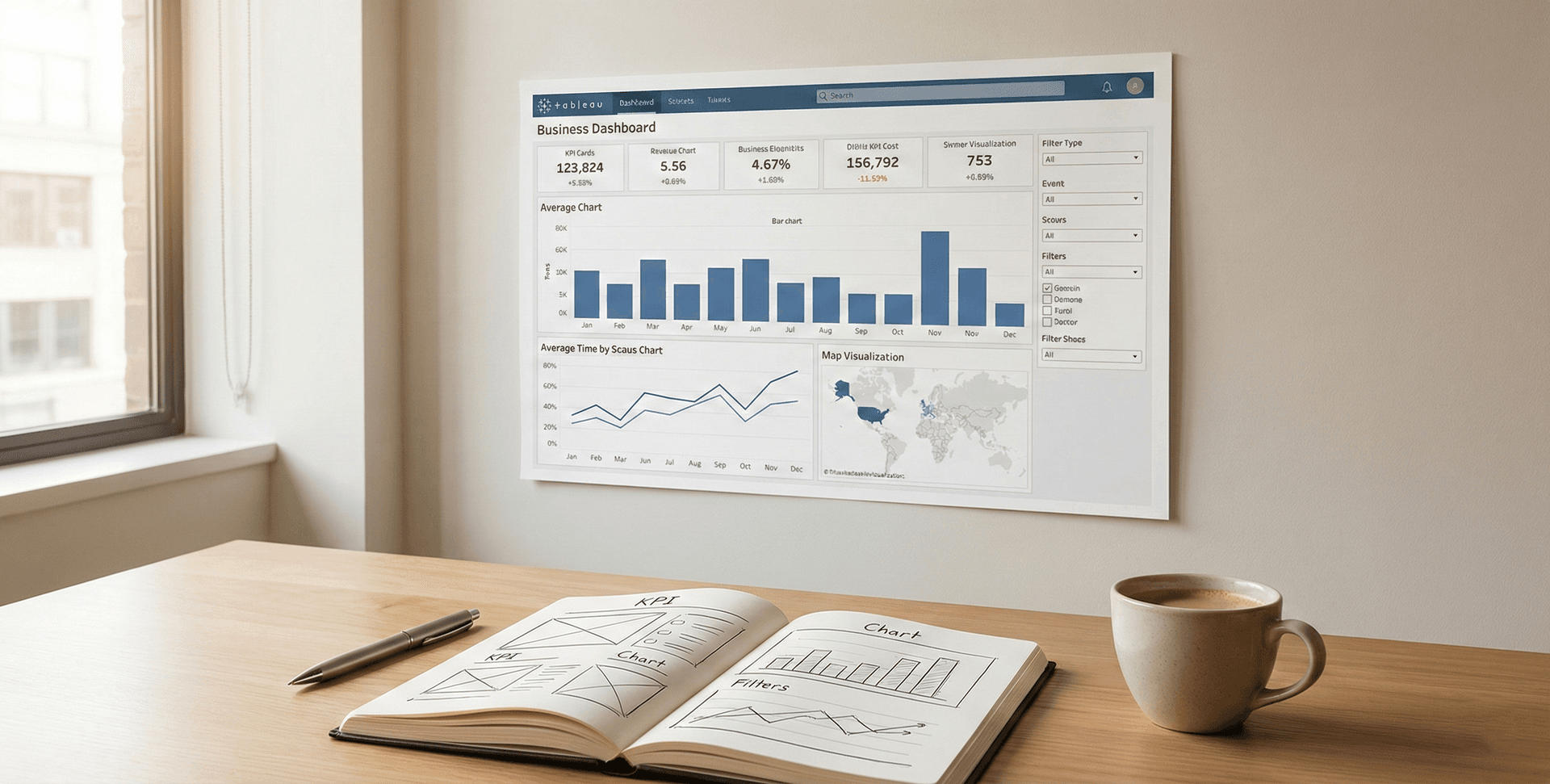
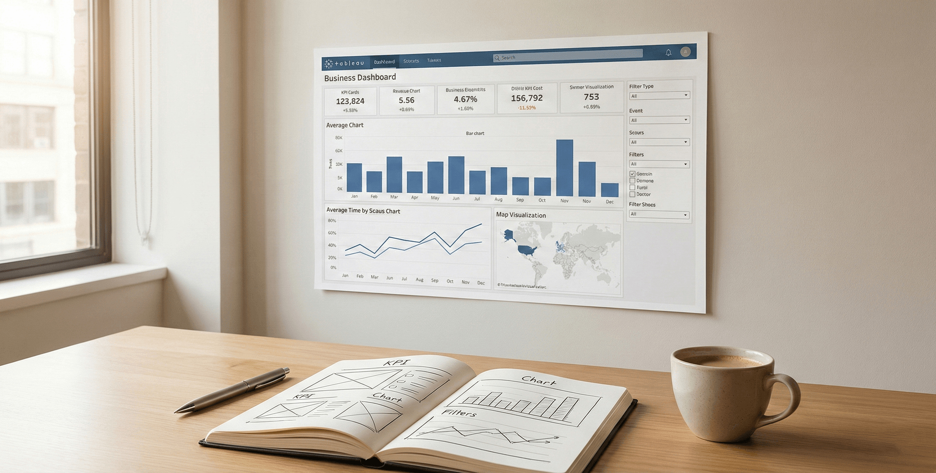
In today’s data-driven world, the ability to transform raw, complex datasets into digestible, actionable insights is a superpower. For any aspiring or seasoned data analyst, Tableau dashboard creation represents the gold standard for visual analytics. When you build dashboards in Tableau, you are not just making pretty charts; you are architecting a visual narrative that empowers stakeholders to make critical business decisions in real-time.
Whether you are tracking sales KPIs, monitoring operational efficiency, or forecasting quarterly growth, a well-optimized dashboard cuts through the noise. In this comprehensive guide, we will walk through the exact methodologies, advanced techniques, and structural frameworks required to master Tableau dashboard creation. By the time you finish reading, you will understand how to connect your data sources, design with user experience in mind, and deploy interactive visual assets that stand out in any professional environment.
Before diving into the technical mechanics, it is crucial to understand why Tableau has become an industry leader in business intelligence. Historically, reporting was a static, tedious process. Analysts would spend weeks compiling spreadsheets, only to present a flat PDF that was outdated the moment it was printed.
Modern data visualization has shifted this paradigm. Tableau allows for real-time data connectivity, meaning your dashboards update dynamically as your underlying data changes. This enables a reactive and proactive business strategy. The human brain processes visual information 60,000 times faster than text. By utilizing color, size, and spatial positioning, an expert data analyst can highlight anomalies, trends, and correlations that would otherwise remain buried in millions of rows of alphanumeric text.
For professionals looking to build foundational skills, exploring structured business intelligence training is a critical step toward understanding how these visual tools integrate with broader enterprise architectures.
To excel in Tableau dashboard creation, you must first become fluent in the software's unique vocabulary and structural environment.
The foundation of any Tableau worksheet is built upon Dimensions and Measures.
Understanding the difference between discrete (blue pills) and continuous (green pills) fields is paramount. Discrete fields create headers and separate your data into distinct categories. Continuous fields create continuous axes, allowing you to plot trends over a unified scale, which is essential for time-series analysis.
The Marks Card is where the magic of visual encoding happens. Here, you can drag your data fields to manipulate the Color, Size, Label, Detail, and Tooltip of your charts. Mastery of the Marks Card is what separates a basic graph from a highly intuitive, multi-layered visualization.

A dashboard is only as reliable as the data feeding it. Data preparation is arguably the most critical step in the entire analytical workflow. If you attempt Tableau dashboard creation with messy, duplicated, or unstructured data, your final output will be misleading.
Tableau offers unparalleled flexibility in data connectivity. You can connect to flat files (Excel, CSV), relational databases (SQL Server, PostgreSQL), and cloud data warehouses (Snowflake, Amazon Redshift, Google BigQuery). Depending on your use case, you will choose between a Live Connection (best for real-time monitoring) or a Tableau Data Extract (TDE/Hyper). Extracts take a snapshot of your data, saving it locally to vastly improve dashboard load times and performance.
Often, the answers you need do not live in a single table.
Ensuring your data is meticulously structured is a core competency taught in top-tier advanced data analytics courses, ensuring analysts do not falter before the visualization phase even begins.
Now we reach the core execution. Building a dashboard is an architectural process. You must build individual components (worksheets) before assembling the final structure.
Never start dragging and dropping without a plan. Ask yourself: Who is the end-user? What specific business question are they trying to answer? Sketch a wireframe. Place high-level Key Performance Indicators (KPIs) at the top, trend lines in the middle, and granular, detailed data tables at the bottom. This follows the natural human reading pattern (top-to-bottom, left-to-right).
Create a new worksheet for every individual chart you need.
Click the "New Dashboard" icon. Before bringing in your sheets, define your Dashboard Size. If you are building for a desktop monitor, "Automatic" or a fixed width of 1200px is ideal.
Tableau uses a container system for layout.
A static dashboard is just a digital poster. To truly leverage Tableau dashboard creation, you must add interactivity through Dashboard Actions.

Once you have mastered the basics, integrating advanced features will elevate your dashboards from functional to exceptional.
Sometimes your raw data doesn't contain the exact metric you need. Calculated fields allow you to write mathematical formulas, string manipulations, and logical statements to create entirely new data fields. For instance, creating a Profit Ratio by dividing SUM([Profit]) by SUM([Sales]).
LOD expressions are incredibly powerful. They allow you to compute values at the data source level or the visualization level, granting you ultimate control over your aggregations. Using FIXED, INCLUDE, or EXCLUDE statements, you can calculate complex metrics like "Average Customer Acquisition Cost per Region" regardless of how the end-user filters the view.
While filters limit the data in the view, Parameters act as dynamic variables that users can change to alter calculations, swap dimensions, or change reference lines. For example, you can create a parameter that allows a user to type in their own "Target Sales Goal," and the dashboard will dynamically update to show which regions met that custom threshold.
Mastering calculations and parameters is essential for any modern professional, and these concepts are frequently bundled into comprehensive certification programs designed to validate technical expertise.
Data analysts are not just mathematicians; they are visual communicators. Poor design can ruin excellent data.

A beautiful dashboard is useless if it takes five minutes to load. In the corporate world, speed is paramount. Performance optimization must be a priority during your Tableau dashboard creation process.
Modern data analysis doesn't happen in a vacuum. The insights generated from your Tableau dashboards must feed into larger operational strategies. By integrating visual analytics into digital marketing strategies, for example, organizations can track campaign ROI, customer churn rates, and ad spend efficiency in real-time.
Furthermore, as the Featured Image of this article suggests, we are moving toward an era of Agentic AI & Autonomous Workflows. In the near future, Tableau dashboards will not just be static destinations to view data; they will be integrated into AI-driven workflows where anomalies detected in a dashboard automatically trigger operational workflows, alert managers via Slack, or adjust marketing spend automatically. Staying ahead of these trends requires continuous professional skill development and a commitment to lifelong learning.

Even experienced analysts fall into traps. Here are the top mistakes to avoid:
Q1: Do I need to know SQL to use Tableau? A: While you can use Tableau without SQL by connecting to Excel or CSV files, knowing SQL highly benefits a data analyst. It allows you to write custom queries, clean data at the source, and understand the structural logic of the databases you are visualizing.
Q2: What is the difference between Tableau Desktop and Tableau Public? A: Tableau Desktop is the paid, enterprise-level software that allows you to connect to local files, cloud databases, and save your work securely. Tableau Public is a free version, but you can only connect to limited data sources (like Excel/Text files) and all your work must be saved to the public internet, making it unsuitable for confidential company data.
Q3: How long does it take to learn Tableau dashboard creation? A: You can learn the basics of dragging and dropping in a few hours. However, mastering advanced calculations, LOD expressions, and dashboard performance optimization takes months of consistent practice and real-world application.
Q4: Can Tableau handle big data? A: Yes. Tableau is designed to handle massive datasets, especially when utilizing Tableau Data Extracts (Hyper engine) or when connected to powerful cloud data warehouses like Snowflake or BigQuery that process the heavy lifting on the server side.
Q5: Is Tableau better than Power BI? A: Both are exceptional tools. Tableau is generally praised for its intuitive visual exploration and handling of large, complex data structures with superior visual customization. Power BI is often chosen for organizations already deeply entrenched in the Microsoft ecosystem (Azure, Excel, Teams) due to its seamless integration and lower initial cost.
Mastering Tableau dashboard creation is a transformative journey for any data analyst. It bridges the critical gap between cold, complex datasets and strategic business intelligence. By focusing on meticulous data preparation, understanding the core mechanics of dimensions and measures, and adhering to strict visual design principles, you can build interactive experiences that drive real value.
Remember that a successful dashboard is not defined by how complicated it looks, but by how easily it answers the user's questions. Avoid clutter, optimize for performance, and continuously seek feedback from your end-users. As you continue to refine your technical skills and integrate these visualizations into automated workflows and broader business strategies, your capacity to influence organizational decision-making will grow exponentially. Start building, keep iterating, and let the data tell its story.

Seasoned Business Intelligence and learning and development professional with over 11 years of experience empowering students and professionals to unlock career success through data-driven skills. Specializing in Power BI, Tableau, and Prompt Engineering, Ashish is known for delivering practical, high-impact workshops and training programs across academic and corporate sectors.